Sunday, December 20, 2009

Myga logo design


Hi all. I know I haven't written an article for an long time. It has been pretty busy. One of the things that happened was the start of a collaboration with some other independent designers,under the name Indyvisuals. The Indyvisuals is a four member design band: Masterview, Design Insane, The Rut and me.
The latest project we have been working on is the branding of a live bar named
Μύγα, which means fly(the insect) in greek. The first brief we got was "We want a fly", so we tried to get more information we got "People don't like flies cos they come and bother you and flies spread deceases. And we want to open a bar that will have good music, good acts and it won't be low quality like the most of the clubs and bars in greece". So, we started working on flies. We worked on many ideas with various applications, flies on many surfaces, flies on records, with guitar picks, flies flying leaving traces, flies,flies,flies...


At one point we started working with an M and we tried to make a continuous one-stroke M which gave us the idea that it could look like a fly. And this actually led to the "winning" logo, not known at the time.


So we created the grid of the logo.


When the time came to meet with the client, we decided that we would present all the logos we designed, as we think it is good to show the ideas you have regardless of what you think the client might like or not. Because you never know.. We were surprised that they picked the logo we liked the most. After that we started working on the typography, we wanted to create a unique type to compliment the logo and not just use something common. Based on the logo we needed something geometric with straight lines and circles, we needed to create glyphs and we wrote the word μύγα with a marker a couple of times to see how the hand writing connects the letters.


Always we work the logos on white and black because that it is important to be able to communicate in neutral colors. When time came to pick colors, we first thought of the warning colors yellow and black but then decided we needed to soften them up a bit, so we used a hazy yellow and grey instead..


We also created a pattern based on the logo, to use on posters etc. We took inspiration from the arabic patterns and motifs.


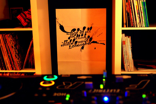
This is the first promotion poster that we created for the bar.


indyvisuals
Masterview
Design Insane
Til01
Myga in Athens website

Sunday, November 01, 2009

Here i am finally Online.


My web site is finally online, soon i will write an article about
how i made it with indexhibit

Monday, April 20, 2009

Think Twice

One of the last projects i have been working on was for the new record of Palov & Mishkin from Cast-a-blast. it was actually a collaboration project with Petros Aka Design Insane. When Blend approached us to design the cover, he only gave us a clue: "Tree". Me and Petros started to thing about trees and typography but we gave it up as soon after we started playing with the papers that we used for the sketches and we thought it would be a nice to create a tree made out of paper and photograph it. So the first results looked like this.We thought that this would bring an ecology feeling which was not in the brief, so i continued playing with the papers and i came to this idea and afterwords i added the typography.Palov & Mishkin Think Twice coverPetros on the other side used a brain vector with the typography in to it and came to this one.When Blend visited us back in the office to see the final layouts he could never figure out what we were up to 2 weeks working on his new cover. The final decision was the graphic version of the brain.

Monday, March 30, 2009

Tailored By Umbro England

Im a huge football fan and i have a small collection of football jerseys. Last saturday nIght Umbro released the new England football kit on the international friendly game of England vs Slovakia.
Umbro have been designs football kits for England for many years. The kit is full white more like the old style that England used to wear back in 1965 until 1970. The 3lion logo has been redesigned and the opposite team is now a part of the logo as is used to be in 50s.
Umbro also released the New ads presenting different cultures lifestyles wearing the new England jersey.

At Umbro's Flickr page you can find a huge collection of football kits that umbro has designed through the years, the history of Umbro, through the logos.
and a part of the football history, enjoy them all.
umbro.com

Tuesday, March 10, 2009

The Periodic Table of Adobe Shortcuts

The most of designers we use Adobe products and we love to use shortcuts, the design by vent created 3 unique Periodic posters of adobes shortcuts explore them all.
I love illustrator thats the reason present it first.
more from designbyvent

Friday, March 06, 2009

the official Objectified poster!

Michael C. Place and his studiomates at Build have come up with an awesome poster design for Objectified, featuring drawings of dozens of objects from designers in the film and more. The best part of the poster is the bottom row of images, which are the objects we used to actually make the film (genius idea, Michael!).

Looks like we’ll have to be patrolling the walls at South by Southwest again this time. 27″ x 39″, metallic silver and black, lithograph. They will be adding them to the shop soon.
objectifiedfilm.com

Thursday, March 05, 2009

The story of a bird that was created free and it was copyrighted

Ok Here we have a Artist by the name Patrick Fore who presents this wallpaper as his personal work, its really nice but...

Well lets take a minute that reminds me of something O yes its a personal experiment of a friend of mine Charis Tsevis he is the real designer of this artwork.
The original artist Charis Tsevis says: "Licensed under Creative Commons for NON commercial use only" and the Patrick Fore has this artwork as copyrighted? And gives its as his wallpaper created by him through his website?
And even more he publishes this work in other networks like Creative cmyk Well this is how things work! First we steal the work of an artist with Creative Commons and then we copyright it and we presented as our work. Ok! Im not a good designer, I’m trying to become one, but I will never present others peoples work as mine I will try to discover the way he works I think that when we are young designers it is ok to imitate others works. But after a while the designer will filter down the work that he sees and will create a new or fresh style
And as Picasso ones said
Bad artists copy. Good artists steal

Well Picasso did not say to copy other people work but the things that are given to us free from the nature.

Wednesday, March 04, 2009

The pirates that wrote true History and not a myth

The first trial of thePirateBay came to the end.
this is the thanking letter of the pirate bay

Today was the last day of the (first?) trial against The Pirate Bay.

First let us pose a huge thnx to internets for all the tremendous support and help we have seen. We would like to thank you for the millions(sic!) of tweets, emails, songs, smiles, blog posts, judicial advices, videos, comments, torrents, articles, translations, services, ideas and love that has been produced around the spectrial.
This thank you goes out not only to all internets, but also to the cops, court house clerks, coffeeshop waiters, bank officials, average joes, kids, friends, adversaries etc. that has helped us along the way.
We would like to put out a special thank you to our busdrivers, putting up with our blatantly chaotic organisation.
Back to the trial. Yesterday the prosecution plead for banning the essence of the internets, the links. Today the defence responded claiming that services of this kind never can be illegal.
The sentence will not be presented until the 17th of April. While waiting for this big day, we in the Spectrial team already has started to plan what we’re going to perform to celebrate the victory of the internets.
We have already written history, actually more than once.
Now we are creating the future.

more

Wednesday, February 18, 2009

Encore Sans / extreme sans

Encore Sans Pro // By parachute fonts
This is a brand new contemporary typeface by parachute, a perfect alternative to your overused classic sans. Encore Sans Pro does not pretend being different but it does claim its own personality. It is simple and stylish. Encore Sans Pro is a humanistic sans-serif which projects an image of reliability, authority and competence making it ideal for corporate applications. A functional typeface which combines utility with style. Its subtle round characteristics such as the slightly curved-in edges, create a distinctly contemporary look, blending effectively traditional with modern details. Encore Sans Pro is extremely versatile. It comes with 22 weights and supports simultaneously Latin, Greek and Cyrillic. Each font contains 1518 glyphs and is loaded with 22 advanced opentype features. Extreme weights, such as the elegant hairline, are carefully designed to establish an even color throughout, while ultra black despite its heavy characteristics is quite legible and powerful. Other intermediate weights such as light and book are ideal as body text for magazines and catalogs.

Links
Encore Sans
making of

Saturday, February 14, 2009

typographicposters.com


Im happy to announce that i was invited to typographic posters
typographicposters.com

Thursday, February 12, 2009

Design Walk 09 "First of all we think the world must changed"


Well i know it is thursday but still i try to find my after this years design walk. It was my first time to participate in this event comparing to the other 2 years that i was a vier.
In an earlier article i said a few things about the event, but now its the time to write the review.
For me it was 3 days full of fun with good friends and beers. / no beer no friends around.
For me the project was one great month hugging out with friends trying to find the brief of our project allot of chat in small bar called cazu drinking coffee and beers from Barack O'barman. When finally we got our ideas in a box we just couldn't close it and then there were popping out even more, better and worst, But what can you do with them? Thats a deferent story.
The 3 day of the main event I was at the office, with the other lads and chatting with people, designer architects, what ever can you imagine there were allot of fun in the crew. and people seemed to be enjoying it as much as we did, Saturday night the Dj of the crew Jeff & Blend from Cast a blast gave to the office a little Club mode with people dancing. after the party what? Well probably we went out for a drink You know after beers sure you need a drink to relax
Yes sure the 3rd day was so cool having interesting chats,
What was the damage? A nice project that we all enjoyed it, a great party, lots of friends new and old-ones and a lot of passion for the future to work harder.
At this point i would like to thank (for the first time) the crew
Petro aka design insane
Kosta aka design indyvisual
Xristos aka cynic desgin
Blend & Jeff form Cast A Blast
Giorgos S Vlahos
Psit, Nasso K and every one who gave the support so this project could be done.


Wednesday, February 11, 2009

NEW NIKE TIL01 Dunk Low

This my new NIke til01 Dunk Low Limited edition.
behance.

Tuesday, January 27, 2009

First of all we think the world must be changed


…the challenge is to change the world!

My friends over the Indyvisuals design studio (they specialize in creating websites, online applications as well as flyers, posters and cds) with the very help of pSit, cast-a-blast, cynic design and alex k., will take part at this year’s Design Walk, im invited to participate on February 6-8 2009 in Athens.

Be around for more…!

Thursday, January 08, 2009

Selected work of 2008

This is selected work that I created last year i hope you will enjoy them as i did.
Happy new Year

"As the world my eyes see"
"Satisfaction is the death of desire"
"You are a f*cking Pig"
"Red wall" illustration for Fault Magazine Uk
"Jusqu'ici tout va bien." in the memory of Alexis Grigoropoulos
til01"The Future is unwriten"

Thursday, January 01, 2009

10 best typeface design of 2008

The new year offers a pretext to reconsider all the creations carried out during the last year. Beautiful creations to tell the truth, in all the fields and in particular in that of typographical creation.
Rich and varied work, having each one their specificities, their functions and their styles. Original work which particularly allured me and I want to make you profit in this article.
Discover in the continuation, 10 creations typographical which held my attention this year 2008.

PF Centra Pro

The project of the Centro character began in 2005 by Central Serif then was packed for finally leading to three families of characters: the Central one, Central Serif and Central Slab. The award winning typeface of 2008 at the ED Awards.
An article on the making of of the project is available on the blog of the Parachute foundry which created this great typeface.
The making of PF Centro Pro
More on Centro serif
More on Centro sans
More on Centro slab


FF Netto

Created by Daniel Utz for the Font foundry Make, FF Netto wants to be minimalist: to remove any historical detail to preserve only the essential components.
A function thus, which has as an ambition to simplify the form for a better legibility of the characters.
Equipped with a series with pictograms and arrows, FF Netto is an ideal for the creation of descriptive.


SOHO Gothic

The series of pig iron and cast iron SOHO Gothic is the last stage of project SOHO, drawn by Sebastian Lester.
This family of character proposes seven different, Italic greases included/understood, and is distributed by the Monotype foundry.
For the people wishing to discover the Sebastian designer To ballast, a very good interview comes to be published on site I Coils Typography.


Gloriola

Resolutely contemporary, the family of Gloriola characters was created by the independent foundry Suitcase
A typography without sérif which proposes seven different greases, and which of course makes use of all the possibilities of OpenType by offering small capitals, bindings and a set of alternative styles.
A very beautiful font which was recognized like one of the most beautiful creation of the year 2008 by prestigious Type Director Club.


Skolar

The Skolar was created to allow the publication of information educational goal in various languages. It was created by the Czech designer http://davi.cz " >David Březina and preceded this year of a ED Awards in the category “Prints Original”.
It offers in addition to its many glyphes a multitude of descriptive arrows.


Benton Modern Display

Inspired by Century Expanded of Morris Fuller Benton, the family of characters Benton Modern Display was drawn by Dyana Weissman and Richard Lipton for the foundry Font Office.
A colossal work created for a use in the press or the magazines, which is declined in 36 different styles.


Archer

One of my favorite and about which we already spoke here: Archer, by Hoefler & Brother-Jones.
A mécane full with charm which draws the best from the lesson of the past, but which is integrated perfectly into a contemporary creation.


Katarine

Another creation of quality realized by the Czech foundry Suitcase: Katarine.
Taking as a starting point the structure of DIN or Trade Gothic, it is perfect for a use on a poster for example.
The Katarine offers it also a diversity of style, and even a play of alternative style.


Le Monde Without, Le Monde Mail & Le Monde Deliver

Not one, but three families of characters created by French Jean-François Porchez with whom I had discussed a few months ago.
Three families of characters which are followed but do not resemble and a multitude of styles provision. In short a gigantic work but the result is with the height!


Leitura

The last family of character of this selection should not appear in it, since actually it was published the last year.
Nevertheless it is of a very complete and a great quality, which gives him all its place in this list.
Drawn by Dino Back Santos, Leitura is made up of 6 different alphabets: Leitura, Leitura Display, Leitura Headline, Leitura News, Leitura Without and Leitura Symbols.


A splendid work which was selected the year spent by Typographica like one of most beautiful the typographical creation of 2007.